Store metadata refinement is the first thing that comes to mind of mobile publishers once they hear about App Store Optimization (ASO). For sure, keywords, app name, subtitles, etc. are extremely important for app’s discoverability in the stores. Yet, smart marketers know that the impact of text elements by no means downplays the importance of product page visuals, especially when it comes to conversion growth.
After all, thousands of SplitMetrics tests have proven that less than 2% of app store visitors tap on “read more” button. Indeed, we tend to neglect extensive texts in favor of visual information, our behaviour in the major app stores is no exception.
Taking into consideration that screenshots take a substantial part of store product pages, they tend to draw a large proportion of uses’ attention. That’s why polishing of screenshots has more potential of skyrocketing your app’s conversion than other store page elements.
However, there’s no use applying random screenshot changes in the app stores and waiting for phenomenal results straight away. The truth is, you never know what will work and what will deteriorate your app’s performance. That’s why A/B testing is a must when it comes to ASO.

Image Source: SplitMetrics
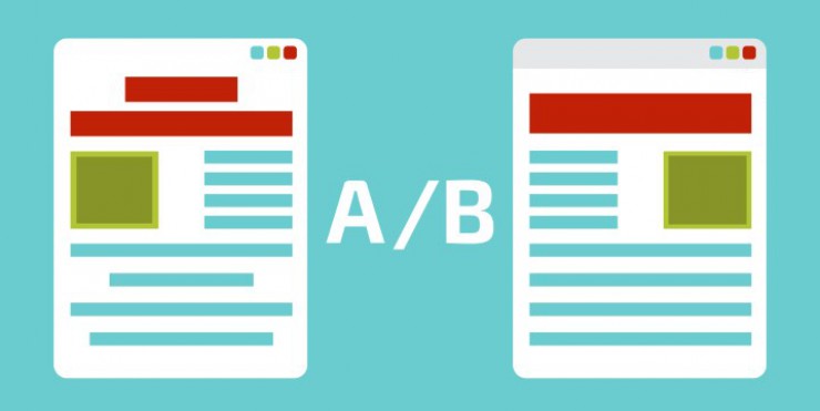
A/B testing or Split-testing is a method of hypothesis checking. Two variations are compared in the course of such tests and the results help to identify an option with the best performance. On one hand, easy mechanisms stand behind A/B testing, on the other hand, the process isn’t as straightforward as it may seem.
Once you decided to use A/B testing to perfect your screenshots, you should take all of the following steps to ensure trustworthy results which will really make a difference.
Here are core ingredients of any quality A/B testing strategy:
- analysis and variations brainstorming;
- designing of screenshots;
- running your A/B experiment;
- evaluation of results;
- results implementation and follow-up experiments.
Let’s dwell on each step of this never-failing A/B testing strategy.
Pre-A/B Testing Analysis and Variations Brainstorming
The first thing you should remember is that any A/B testing activity is doomed if it doesn’t rely on a solid hypothesis. Split-tests for the sake of split-tests make no sense. So first of all, you should come up with a screenshot idea worth proving.
Wonder where to take such idea? The answer is simple – research. Treat major app stores as show windows and determine best screenshot practices in your app category and the stores in general. It goes without saying that above all you should look up to the industry leaders.
At identifying the latest trends concerning screenshots in the app stores, it’s time to prioritize ideas and elaborate hypothesis for testing. Think how you can reflect best app store screenshot practices. Here are a few assumptions worth testing:
- My app will get more installs if I change the orientation of the screenshots. For instance, Rovio tested vertical screenshots against horizontal ones. As a result, portrait orientation won and the conversion rate of Angry Birds 2 increased by 13%;

Image Source: SplitMetrics
- Users will install my app more often if the screenshots will highlight value and benefits not merely app’s features;
- Using all available screenshots will favour my app’s conversion;
- The usage of social proof (testimonials, media mentions, and awards) will make my app more appealing for app store visitors;
- My app’s conversion will grow if I reflect my app’s latest feature in the first screenshot.

Image Source: Apple
Studying competitors’ product pages is definitely not enough. You should have a clear vision of the market. Profound analysis of your target audience is another success ingredient of your A/B testing. You should know your ideal users: their age, sex, interests, etc. Qualification of traffic sources is another important activity within this analysis stage.
This step also involves goals setting and choosing the experiment type which you plan to launch. It may be screenshots testing on your product page or in the context of the search results and category search. The first experiment type will help to boost overall conversion of your product page, while the latter will show how your screenshots perform next to competitors.
Variations Creation
Well done! Now you have a couple of hypothesis to test. It’s high time to implement these ideas in actual screenshots.
For instance, ZiMAD decided to test redesigned screenshots for the game Bubble Birds 4. New screenshots reflected classic game screenshots layout: main character in the front of the image, gameplay background, powerful caption which highlights features.
The company wanted to test if the game category best practice will increase the converting power of their product page. Yet, they were not that straightforward with ‘gameplay background’: their new background encapsulated art overlays, real screenshots, and gameplay elements. As a result, new version got a 32% lift in conversion.

Image Source: SplitMetrics
If you plan to use a simple pattern in your screenshots (solid background and device), you can do without a designer, as there are loads of screenshot builders to help you with it.

Image Source: The AppLaunchpad
However, if you plan to apply something more creative (сonnected or splash screen screenshots), professional designer skills are a must.

Image Source: Apple
Running A/B Experiments
First of all, you should choose a tool for A/B testing. You can consider Google Play Experiments providing you have only Android apps. Facebook ads is another option as you can test various screenshots within ad banners.
Another alternative is SplitMetrics, it’s an all-in-one split-testing platform which helps you to run experiments for both iOS and Android apps. Moreover, it makes pre-launch experiments possible.
No matter what platform you choose, your experiment should comply with the following rules:
- Variations should look like store pages to make users behave naturally;
- Traffic should be divided equally between variations;
- Test only one hypothesis during one test;
- Your experiment should be filled with enough traffic to reach statistically significant results (this amount depends on app’s conversion rate and traffic quality: the higher conversion, the less users you need);
- Remember to utilize traffic source and targeting you revealed during the analysis stage;
- It makes sense to run an A/B test for a week to register user behaviour on different weekdays.
Test Results Evaluation
Here goes the favorite part of most publishers – results evaluation. It’s the moment of truth when you find out whether your hypothesis was right or wrong. Results may be evident or ambiguous, your redesigned screenshots might beat control version or trigger conversion decrease.
One way or another, it’s vital to keep in mind that there is no such thing as negative results when it comes to A/B testing. Even if your beloved freshly designed screenshot set doesn’t perform that well, it’s still the result, which prevented careless changes on your product page and further conversion decline.
For instance, Mallzee ran a series of A/B tests and the overwhelming majority of their assumptions were proven wrong. However, this seemingly disastrous outcome prevented the company from the conversion fall by 25%. The case demonstrates once again that testing is a must and there’s no place for guessing in ASO.

Image Source: SplitMetrics
On this step, providing you use advanced A/B testing tools, you can learn and analyze how store visitors interact with your product page before installing the app. Such metrics as interaction funnel, time on page, scroll heatmaps, etc. will help you understand your target users better and therefore polish your marketing strategy.
Results Implementation and Follow-Up Experiments
You have two options on this stage:
- If you have an apparent winner variation, you can implement changed screenshots in the app store straight away;
- You can use the results of your A/B experiments in further testing.
You may ask, “Why should I waste my time on follow-up tests if I’m pretty satisfied with the results of initial testing?” First of all, congratulation on successful A/B testing. Secondly, there’s still a lot to be done unless your conversion is 100% and it’s nearly impossible.
The truth is, great apps keep their top positions because they never stop developing the product and optimize all the elements that can influence conversion. Let’s take Prisma, the app which was named among the best applications of 2016 according to Apple. Prisma ran a series of tests to optimize screenshots, they resulted in impressive 12.3% lift in conversion.

Image Source: SplitMetrics
Considering viral popularity of the app, this increase meant thousands of extra downloads every day. Nevertheless, the team didn’t stop and kept playing around different screenshots.
These experiments took the increase of conversion even further, it reached 19.7% eventually. It proves one more time that there’s always a room for improvement.

Image Source: SplitMetrics
Wrapping it up
Every app publisher has to understand that App Store Optimization is an ongoing process, a single A/B test for screenshots will barely make a difference. This ASO checklist can help you to get your bearings, once you get down to app store optimization. You can also check AppTweak’s ultimate ASO Checklist.
It’s also important to remember that iOS and Android users behave differently in the stores. No matter how tempting it is, never apply results of, let’s say, experiments on Apple App Store to your product page in Google Play. It may result in major conversion decline.
If you are determined to change the conversion of your product page for better, it’s vital to arm yourself with patience and sense of purpose. Keep moving beyond and keep experimenting with your screenshot layouts to scale results. Good luck!
Source: apptweak


